Alba Ramos is a photographer with an artistic style that captures authentic emotion through carefully composed imagery. Her personal brand required a visual identity that would evoke elegance, serenity, and a deep connection to nature.
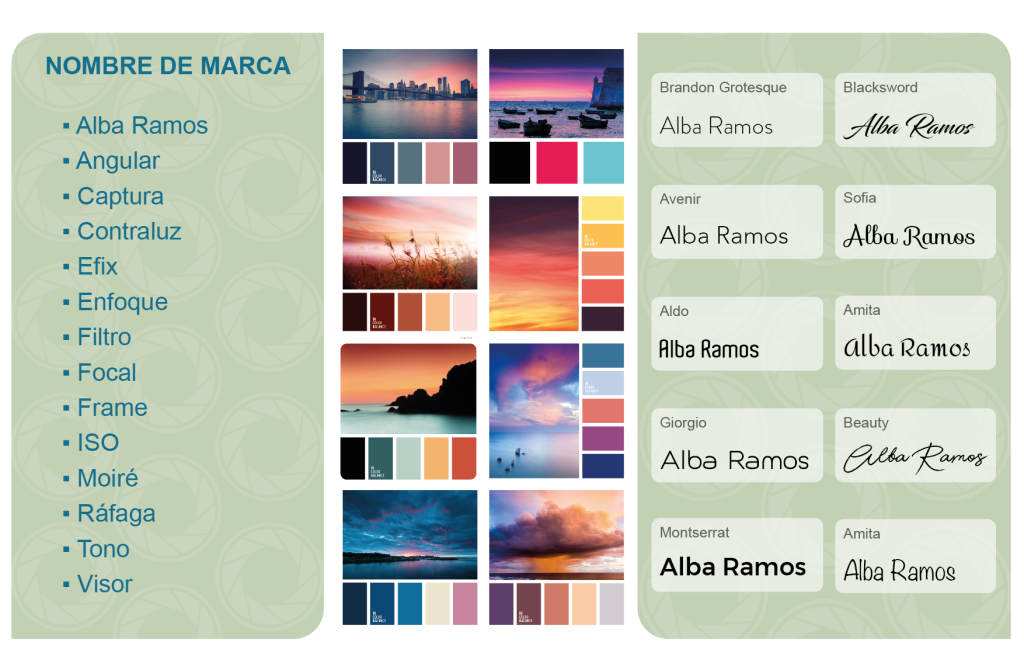
1. Naming and Concept A list of conceptual and photography-related names was initially explored, the decision was made to use Alba Ramos as the brand name, reinforcing her personal and professional identity.
2. Context and Inspiration The starting point was the meaning behind her name — “Alba,” (dawn), this inspired a color exploration using natural sunrise tones — blues, pinks, and lilacs — to reflect the calm, light, and emotional depth of her photography.
3. Typography After exploring various typographic styles, the chosen font, Sofia Regular, combines soft curves and an elegant feel, perfectly matching the brand’s artistic and approachable personality.
3. Color Palette
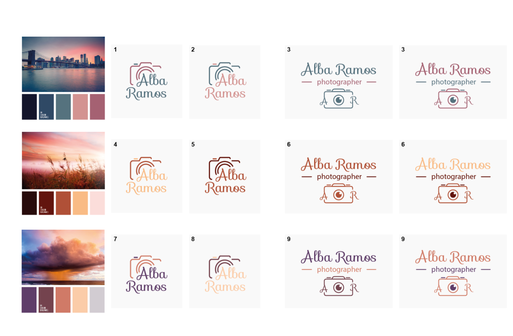
Some moodboards were created using real landscape photography to extract color palettes reminiscent of sunrises and sunsets. The final selection includes tones like navy blue (#1E274A), muted teal (#50737C), and soft pinks (#D18F8E, #A86475), achieving a balance between warmth, elegance, and visual sophistication.
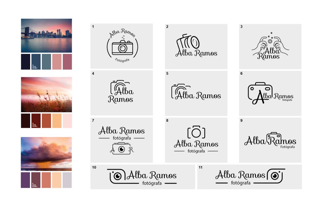
5. Visual Icon
A minimalist camera icon was designed to accompany the logotype, framing the brand name while reinforcing the connection to photography. This icon also functions as a visual texture used across brand applications.
5. Logotype and Variations
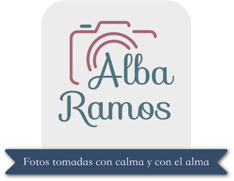
Multiple versions of the logo were developed to ensure versatility across formats: full-color, monochromatic, and high-contrast applications. The main version highlights the harmonious integration between the camera icon and the name “Alba Ramos,” providing a strong yet delicate visual presence.
6. Slogan and Brand Tone
The chosen slogan was: “Photos taken with calm and with soul”
This phrase communicates the pace, intention, and emotional depth behind Alba’s photography. It captures the essence of her brand — slow, soulful, and meaningful.
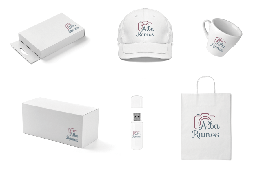
7. Brand Applications
The final mockups showcase how the identity works across real-world uses: business cards, packaging, merchandise, and digital branding. These applications demonstrate a consistent and flexible visual system, ready for implementation across social media and beyond.